 Skip to content

You've probably been there already. You upload a decent-looking cover photo to your Google Business Profile, step away, then check Maps on your phone and realise Google has shown a different image entirely, or chopped the one you chose so badly that your logo is half gone. That's the point where the job stops being “upload a picture” and becomes photo governance, choosing an image that still works after Google crops, reorders, or swaps it.
For UK local businesses, that single image isn't cosmetic. Google's own cited benchmark shows that businesses with photos get 42% more direction requests and 35% more website clicks than businesses without photos, while listings with 100+ photos receive 520% more phone calls and 2,717% more direction requests than the average listing. That makes the cover photo part of a wider visibility system, not a decorative extra. It also means the safest approach is usually the most practical one: an image that looks clear at a glance, holds up in mobile crops, and resembles the business on a normal day.
Table of Contents
- Why Your Cover Photo Matters More Than You Think
- Getting the File Specs Right Before You Design Anything
- Designing a Cover That Survives Google's Recropping
- Uploading and Setting Your Cover Photo in GBP
- Measuring Whether Your Cover Photo Is Working
- Common Mistakes That Quietly Undermine Your Cover Photo
- Pre-Upload Checklist and Quick FAQ for UK Businesses
Why Your Cover Photo Matters More Than You Think
A local trades owner once asked why the photo on his profile wasn't the one he had uploaded the night before. On desktop, the cover looked fine. On mobile Maps, Google had promoted a different image from the library, and the crop had cut through the sign on the van. That's a common moment of frustration, but it's also the right moment to treat the cover photo as a business asset rather than a one-off upload.

The practical stakes are real. Google's cited benchmark links photos with 42% more direction requests and 35% more website clicks compared with businesses without photos, which is why the cover image belongs inside a wider photo strategy rather than a branding silo. Google also lets owners set or change a cover photo in the Business Profile interface, so this is a repeatable task, not a permanent mistake if the first version isn't right.
The cover photo is the first visual cue
In Maps and Search, the cover image often becomes the first visual impression a searcher gets before they read reviews or click the website. For a service-area business, that might be the front of the premises, a team shot, or a service-in-action image. For a clinic, salon, or home service firm, it can be the difference between looking established and looking anonymous.
That's why the cover shouldn't be treated like a social media banner. It needs to answer a simple question fast, “Is this the business I'm looking for?” A clean, recognisable image helps the profile feel trustworthy before the user takes any action. If the image is generic, dark, or misleading, the whole listing feels weaker.
Practical rule: choose the image that helps a stranger recognise the business quickest, not the image that looks most polished in a design mock-up.
The strongest reference point is real-world recognition. Google's local search work that actually converts tends to come from profiles that make the decision easy, and the cover photo plays a quiet but important part in that clarity.
Reversible doesn't mean unimportant
One reason owners delay this task is fear of picking the wrong image. That fear is overdone. You can change the cover photo again, and you can swap in a better option if the first one doesn't read well on mobile.
The useful mindset is simple. Publish a good-enough, accurate image now, then watch how it behaves. If Google keeps substituting another image, or if the crop breaks the composition, fix the asset rather than leaving it untouched for months. A cover photo is a live signal, not a framed poster.
Getting the File Specs Right Before You Design Anything
Start with the file, not the layout. For a GBP cover photo, the safest working format is 16:9, exported at 1024 × 576 px in JPG or PNG. Google's upload rules also accept files up to 5 MB and a minimum of 250 × 250 px, while practical prep guidance usually points to a working range of 480 × 270 px minimum and 2,120 × 1,192 px maximum.
Those numbers are there to prevent avoidable upload and cropping issues before you open your editor. A large file does not guarantee a better result if the subject sits in the wrong part of the frame, and a square image is the wrong starting point for a surface Google may crop again.
Set Your Canvas for a 16:9 Ratio, Not for Guesswork
Open your editor and lock the artboard to 16:9. In Canva, Photoshop, Affinity Photo, or a simpler image tool, build the master file to the correct ratio first. Then place the subject inside that frame so the main visual still works if Google tightens the crop.
That matters because Google can present the same asset differently across surfaces. A file made for a wide desktop view can lose its value once it gets compressed into a smaller mobile display. The safest habit is to treat 1024 × 576 px as the publishing target and keep the master file at a clean size that exports well.
Keep file handling simple
Use JPG for a standard photo where smaller file size matters. Use PNG if the source image needs cleaner edge detail or includes graphic elements that do not hold up as well through JPEG compression. Either way, avoid piling on too many edits before export.
File size and display quality are not the same thing. A huge export can still look awkward if the subject sits too close to the edge or if text gets squeezed by Google's automatic formatting. A cleaner file at the right ratio usually performs better.
For a better internal process, the GBP management workflow should treat photo prep as part of the upload checklist, not as an afterthought. When you compare what your profile shows against nearby competitors, a local competitor analysis for GBP photos helps you see which file choices hold up in practice.
Designing a Cover That Survives Google's Recropping
A good cover photo is built around the worst crop, not the nicest one. If the image only looks right in the exact frame you designed on a laptop, it's fragile. Google can recrop or substitute images on different surfaces, so the safest composition is the one that still reads clearly when the platform tightens the frame.
Put the subject in the middle
Centre the focal point. That can be the building entrance, the service vehicle, a team member, or the product area that tells the story fastest. Avoid pushing the most important detail to the far left or right, because those edges are exactly where cropping causes damage.
Text overlays are another common trap. A slogan that looks neat in a design tool often becomes unreadable once Google compresses the photo for mobile. The same applies to edge-placed logos. A logo in the corner is usually the first thing to get clipped or blurred in a different surface view.
Choose real business imagery
Stock images are rarely the best answer for a GBP cover photo. They can be attractive, but they don't help a searcher recognise the business quickly. A real storefront, reception area, workshop, team shot, or service result usually does more work because it looks credible and specific.
Lighting matters too. Clean, bright images read faster than dark, moody photos, especially on a phone screen. High contrast helps the eye find the subject without effort. That doesn't mean over-editing the image until it looks artificial. It means making the business easy to see.
If the cover photo needs a paragraph of explanation, the composition has already failed.
The other practical habit is to test the image on both mobile and desktop before you publish. If the crop feels safe in one view but weak in the other, simplify it. This is the part of the process where a small redesign beats a bigger export.
For a deeper visual audit of what your listing is up against, a local competitor analysis workflow is useful because it shows whether your profile image looks distinctive enough in the actual map results, not just in your own folder.
Uploading and Setting Your Cover Photo in GBP
The upload itself is straightforward once the asset is ready. Open your Google Business Profile, go to Photos, then upload the image you want to use. If you already have a strong image in the library, you can choose that instead of adding a new file, which is often the fastest route for businesses that already have decent photo coverage.

The click path that usually works
On desktop, the stable route is:
- Open the Business Profile.
- Select Photos.
- Upload the new image, or open an existing image in the library.
- Use the photo options to choose Cover photo or Set as cover.
On mobile, the flow is similar, even if the wording shifts slightly by interface version. The principle stays the same. Add the image, open the photo's options, and set it as the cover. After that, give Google a little time to reflect the change.
What to check after you save it
The main mistake here is assuming the first thing you see is the final state everywhere. It isn't. Google sometimes takes time to surface the new image, and it may still show another photo in some placements. That doesn't necessarily mean the upload failed.
Check the profile in both Search and Maps if you can. If the intended cover hasn't appeared, confirm whether the image is set correctly in the library first. Then refresh later before you assume the system ignored it. This is one of the reasons photo governance matters. The setting is easy. The display outcome is not always identical.
For a cleaner admin process, the Google Business Profile manager guide is the right place to keep the rest of your profile workflow organised around the photo library, not just the upload button.
Measuring Whether Your Cover Photo Is Working
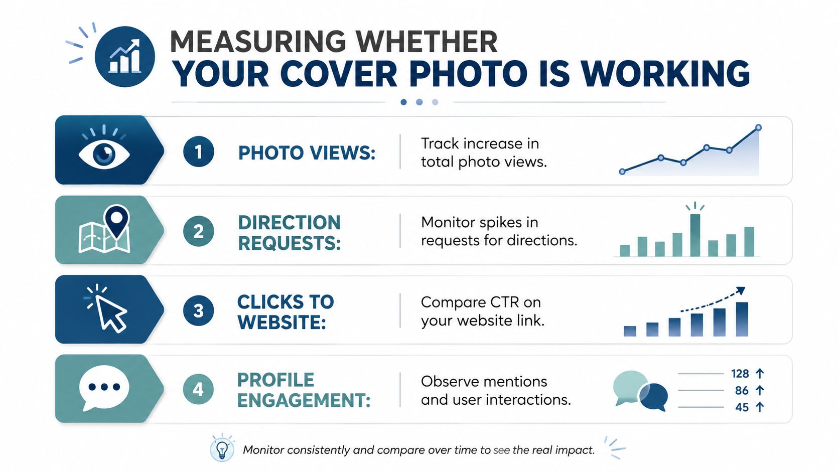
A cover photo shouldn't be judged by taste alone. Once it's live, the question is whether the profile gets more useful engagement. In GBP, the signals worth watching are the ones that show real intent, such as directions, calls, website clicks, and photo views.
Read the right signals
Direction requests matter because they show someone is planning a visit or wants to find you physically. Calls show direct intent. Website clicks show curiosity that's strong enough to leave Maps or Search. Photo views tell you whether the listing's visual layer is getting attention.
A poor first month isn't necessarily a sign of failure. One image change alone won't override weak categories, poor review management, or a thin profile. A good first month usually looks more like a cleaner response pattern across several engagement signals than a dramatic spike in one metric.
Compare before and after, not vanity numbers
Use a simple before-versus-after comparison. Look at a similar period before the change and the same period after it, then see whether user actions have shifted in the direction you care about. If the cover photo is stronger but the profile still underperforms, the issue may be elsewhere in the listing.
Track the change like an operator, not like a designer. The question isn't whether the image looks good. It's whether it helps more people take the next step.
If you already use a geo-grid or location audit, pair the photo change with that data so you can spot whether the listing's visibility has improved for the right queries in the right places. Revisit the cover photo quarterly, or sooner if the business changes seasonally, the frontage changes, or the old image no longer matches what customers will see in person.
Common Mistakes That Quietly Undermine Your Cover Photo
The most common mistake is uploading something that looks nice on a large monitor and then collapses on a phone. Dark images, blurry shots, and text-heavy graphics all fail in the same way, they ask the viewer to work too hard. Google's help path supports real, business-specific imagery, and that's usually a stronger choice than a polished but generic asset.
The four quiet failures
- Dark or underexposed images: These hide the subject and weaken recognition on small screens.
- Blurry uploads: These can look acceptable in a folder and still feel low trust in Maps.
- Text-heavy designs: These behave like ads, not profile photos, and often crop badly.
- Generic stock imagery: These don't help the user identify the business quickly.
There's also a less obvious failure mode, relying on the assumption that the image you selected is always the one Google will show. It won't always be. Some guidance notes that Google can substitute other recent or high-performing images depending on quality and relevance signals, which means the cover should be chosen as part of a broader photo set, not as a standalone hero asset.
Treat the cover as a live asset
The better habit is to review the image with the business's real environment in mind. A seasonal window display, a new van wrap, a remodelled reception, or a changed team can make an older cover photo feel stale fast. If the business has changed, the image should change too.
That's especially true for mobile-first discovery. A cover photo that depends on wide desktop framing but falls apart in a square or tighter crop can lose the very recognition it was meant to create. The defence is simple, keep the composition clean, the lighting honest, and the subject obvious.
If you want the image to survive Google's reformatting, design for clarity first and aesthetics second. The best-looking photo in a folder isn't always the best-performing photo in a profile.
Pre-Upload Checklist and Quick FAQ for UK Businesses
Before every upload, run the same short checklist.
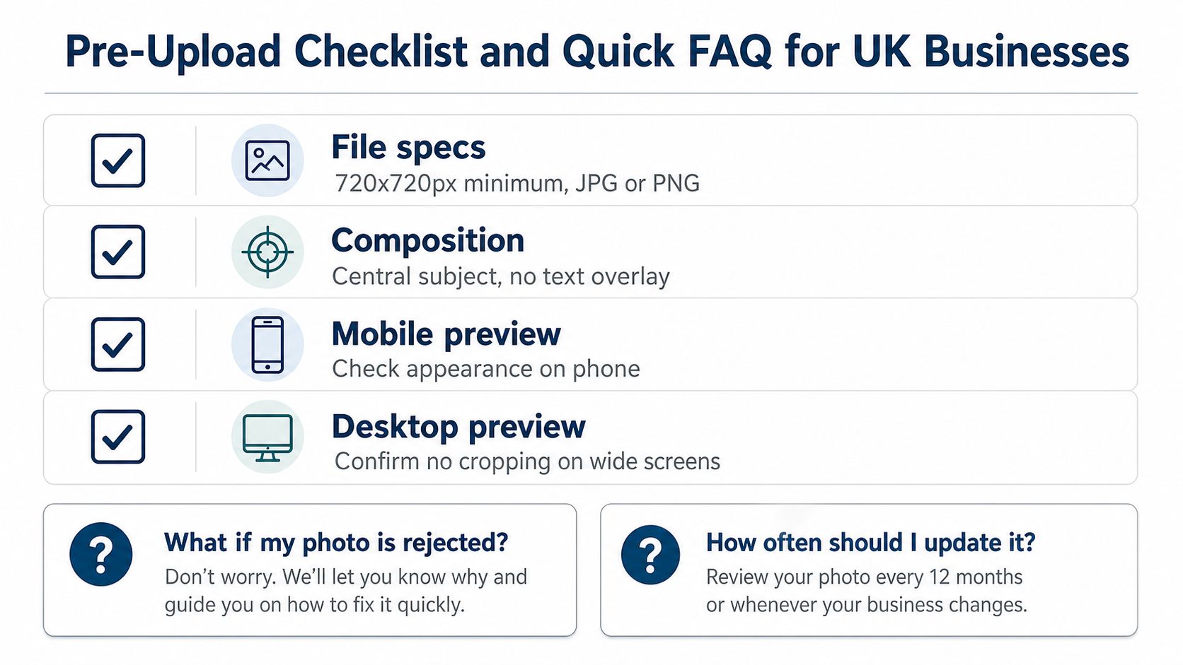
- File specs: Export at 1024 × 576 px, keep it 16:9, and use JPG or PNG.
- Composition: Keep the subject centred, skip text overlays, and avoid edge-placed logos.
- Mobile preview: Check how it reads on a phone before publishing.
- Desktop preview: Make sure it still looks clean in a wider view and doesn't rely on fragile cropping.
- Measurement reminder: Revisit the profile after publishing and compare engagement over the next 30 days.
Quick FAQ
What if my photo is rejected?
Check the file type, file size, and minimum dimensions first, then make sure the image isn't overly edited or unclear. If the upload still fails, re-export it cleanly rather than forcing the same file through again.
How often should I update it?
Update it when the business changes visually, when the seasons change the frontage, or when the image no longer reflects what customers will see on arrival. A quarterly review is a sensible rhythm for most UK service businesses.
Does the cover photo affect ranking or just engagement?
It's safer to think of it as an engagement asset that can support the broader profile. The image itself isn't the whole ranking story, but stronger profile engagement is part of a healthier local presence.
If you want to turn this into a repeatable local SEO habit, use VisiLocali to audit the profile, track map visibility, and decide what to improve next on your Google Business Profile.
